Friday, 28 February 2014

FMP: curb 2, the corners.

I noticed that the streets in Chicago had various corners on cross sections and one way was the curb curving round creating a 90 degree angle. Instead of modelling all of the curbs to create this angle I made one two sided curb that can be turned over and mirrored to be used numerous times in engine. 


This is what the final curb looks like after baking and texturing everything.

FMP: the curb

Here I modeled out some street lamps based of the images I screen grabed from google maps, the screen grabs are from Chicago. I also did a quick road black asset, I may sculpt into this if I have time. 


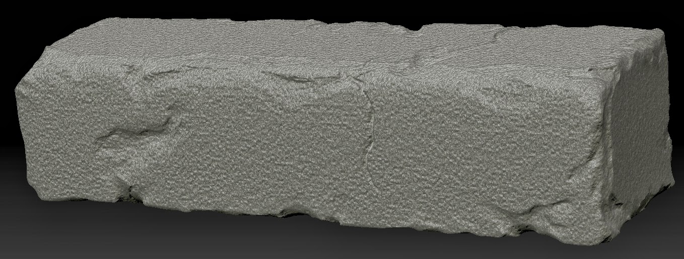
 It was time to start work on the curb, this was meant to be modular but initially I wanted 3 different ones which will have 4 unique sides, this would result in 12 different curb variations. The images above show two out of three, sculpted in Zbrush. After some critique from a friend I realised that three was way too many and one would do so I abandoned these models and worked with one.


This is the high-poly curb I decided to retopologise and bake down, and here are the results after texturing. Here is the final result.


The reason I have left this at 1024 and around 500 tri's is because it will be one of only two curb mesh's imported into engine to make up the whole level, for this I think I can get away with a larger scale. Also it will be close to the player's view so it has priority for detail.


Wednesday, 26 February 2014

FMP: Paintover and Architecture


Here is a paintover I did to get a feel for the destruction I am going for. Though it is not finished the reason I stopped working on it is because I am yet to decide on what kind of tram I want. Also I felt I may put in some larger cracks on the road, maybe to suggest some form of earthquake. 

  
 (all photos taken by me)

During January I found myself in Scotland for a weekend trip. I found some amazing architecture, very 18/19th century, the buildings looked as if they were preserved. Though I am setting my environment in America I thought these would fit really well with my theme, though it proved more difficult to make them in a modular fashion, the outcome should be superior to generic industrial/office buildings.  


Here is a set of 3 modular buildings I made, these should get me around 15 different unique buildings, I think I will work with these first before making anymore for now, I also may have to make more ground floor variations and details as that will be eye level with the player. 


Also starting to get things into engine to confirm/test scale.

Tuesday, 25 February 2014

FMP: development


So after doing some more thinking I realised that the linear setup of my street was far too simple, I decided to curve the street and make it drop around 5 degree's as it progresses, I realise that Chicago is a grid system, I wanted this to loosely resemble the city and be set in America, but not necessarily copy a particular street, as I wanted my own creative control on this.  


 The next thing to build was the tram tracks. For this I made a modular set of tracks, it sits around 1500 tri's which I think is reasonable as this will be instanced in engine. 


Here is a simple render to show the main focal point of the level, the hanging tram. 

Monday, 24 February 2014

FMP: The Beginings


For the first two weeks I debated with myself wether to keep this interior space that I had been working on. I developed it to a stage where a few assets were left before it was ready to texture and my tutors advised me that I may have to leave it out as I have a full exterior level to work on and it may threaten it's completion.

The idea was to start the play here, it was to support the narrative of the destroyed Chicago esq metropolis (the theme of the exterior) but I think for now I will have to focus on the exterior.


Here is the whitebox I worked on early on to help outline the scale and plan of the level, the final render shows a hanging tram in the center of the cross section, this will be on of the primary focal points of the level. 

Wednesday, 12 February 2014

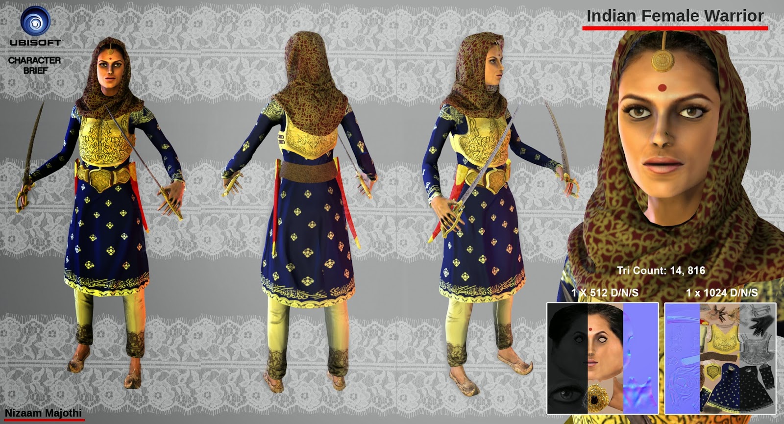
Ubisoft Character Project: Female Indian Warrior


For our final industry ready brief it was Ubisoft with a Character Project. The brief detailed to produce a female warrior, we were given 4 specific areas being Africa, China, Japan and India, time period was not a factor. I decided to go with Indian as I have yet to see it used much at all in video games. I began with moodbaord's to grasp the culture, time period (Mughal Empire/16th century India), I also chose and some religious aspects as the country is heavily influenced by it. 


I began with some very brief silhouettes as I knew what I was already going for. I liked the idea of a protagonist character well geared for battle but also with a RPG orientated look.

Afterwards I did some portrait designs to decide how much jewelry I wanted on the face, as this is a cultural aspect most Indian females would have had.


I also realised that at some point I will have to have model a weapon so some concepts were in order, I really liked the detail those old Indian Talwar swords on the handle, some even having jewels incorporated into the design.

I carried on my designs into full body drawings, I did these in 3/4 view to help me when I get into 3D. When I moved into the colour designs I realised the lack of armour, so I added a full chest plate to suggest a stronger warrior aspect, initially I liked the colours of the first designs.


 After being happy with the designs I decided to create a quick basemesh and move into sculpting. The reason I opted for Mudbox is because at this point in time I was very comfortable with it, I find its interface is also in sync with 3ds max which is a bonus. I decided to go with a headscarf as it is very traditional and was a nice challenge to sculpt.   


I did the retopology using a mix of 3ds max and Mudbox, it speeded up the process as time played a big factor in getting all this done. The texturing was done based of my first coloured design as I felt it was the most attractive.
 The final model was rigged and rendered in Marmoset.